
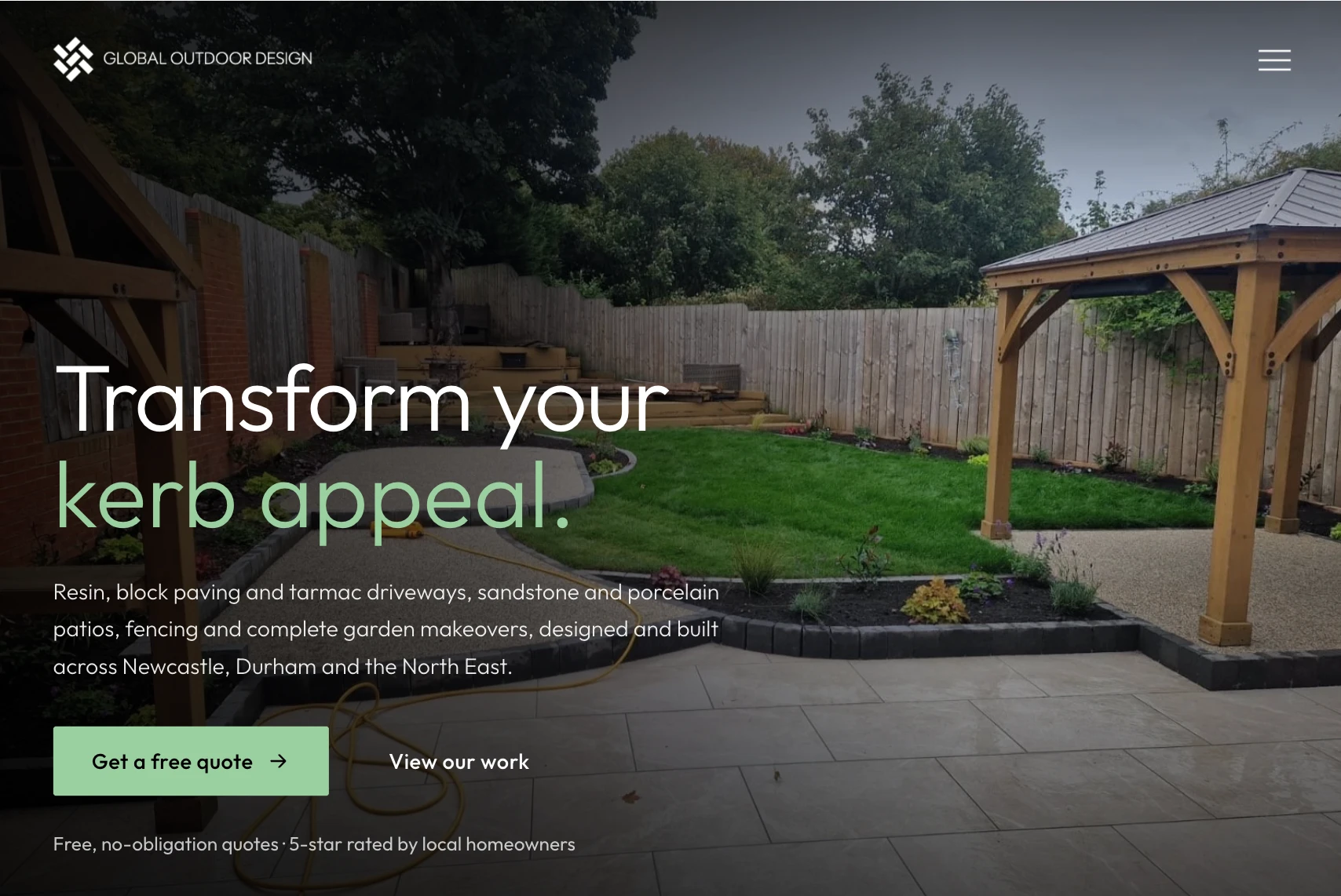
 Website and brandingDriveways, patios and garden makeovers across the North East.
Launching soon
Website and brandingDriveways, patios and garden makeovers across the North East.
Launching soon

Graphic design, Newcastle
Most businesses end up with a logo from one place, a brochure from another and social graphics made in whatever was open at the time. We build one identity, marks, colours, type and spacing, write it down so anyone can apply it, and then make the work from it.
Logo and brand identity, brand guidelines, packaging, print and signage, apparel and social templates, with the source files handed over at the end.
Design

What an identity is
Skip the decisions and you get a folder of files that happen to share a logo. Every hex on this page is the value actually used in the artwork, sampled from the files, not approximated. Charlie runs design, and nothing goes to print until you have signed it off.
What we can help you with
The mark, the submark, the horizontal and the one-colour version, so there is a right version for every space.
Colours with their hex and CMYK values, type sizes, spacing rules and what not to do, written so anyone can apply it.
Artwork converted for the printer in CMYK rather than handed over in screen colour and left to guess.
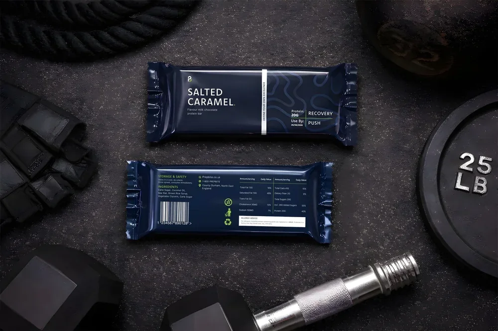
Built to read at arm's length in a second, and to carry a nutrition panel, a barcode and allergen advice without looking like a spreadsheet.
Front, back and chest placements drawn for the garment, in the formats the embroiderer or printer will ask for.
A grid and a set of templates your own team can fill in, so every post looks like it came from the same company.
Pitch decks, brochures and proposals set in the identity, so the thing you send looks like the thing you built.
A tidy-up of the identity you already have, when a full rebrand would throw away equity you've earned.
Vector source, print and screen artwork, the fonts, the licence and a written guide. Full copyright assigned to you.
01. Selected work
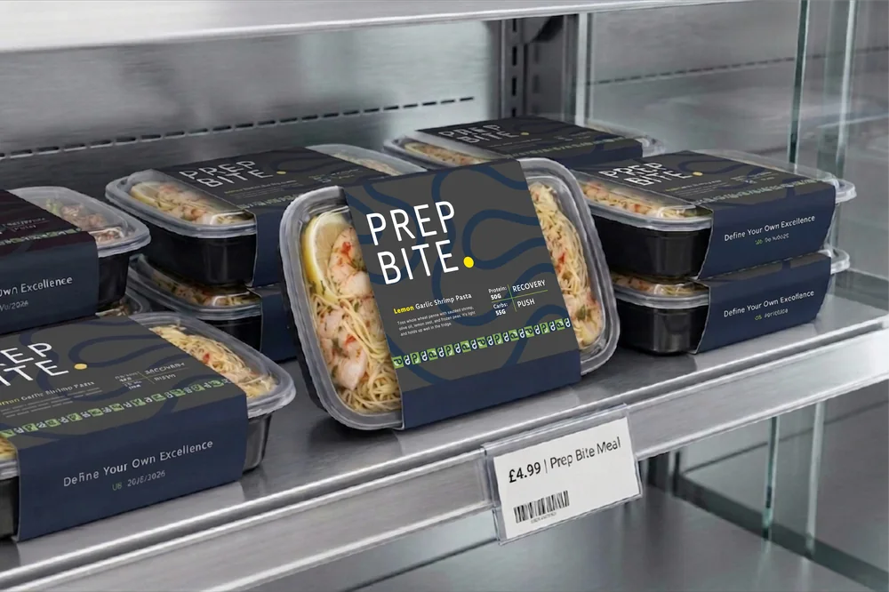
A meal prep brand that had to work in two places at once: on a chilled shelf, read at arm's length in about a second, and on a protein bar wrapper, where the same identity has to carry a full nutrition panel, a barcode and allergen advice without looking like a spreadsheet.
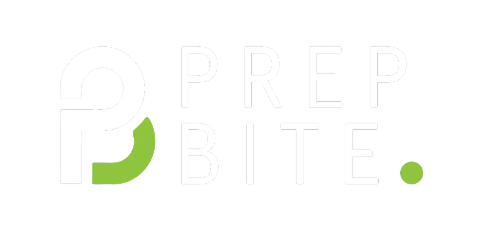
We built the mark as a P and B locked together, so it still reads at 12mm on a wrapper seal and as a submark on its own. The palette runs deep navy for the ground and a single acid green for anything that has to be found in a hurry.
02. Selected work
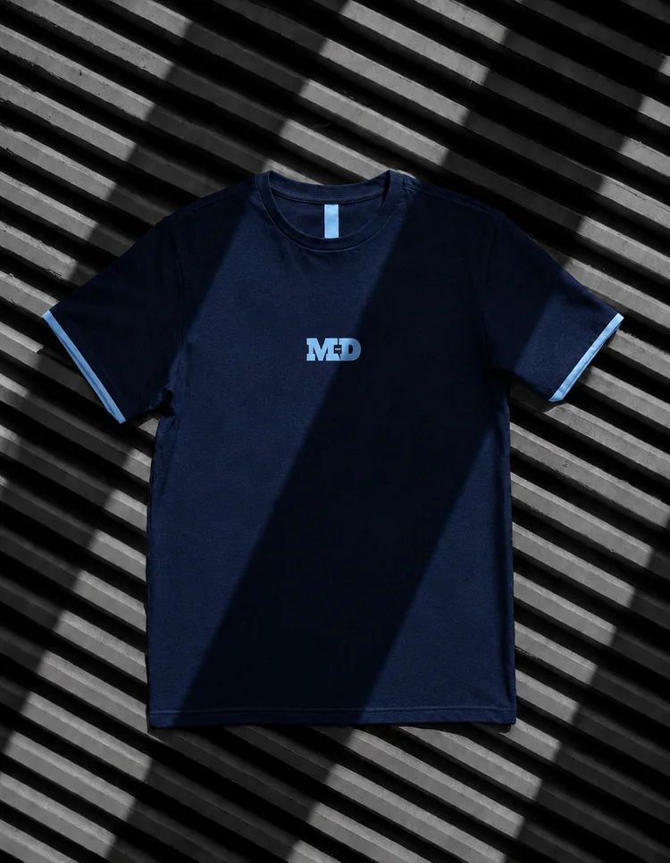
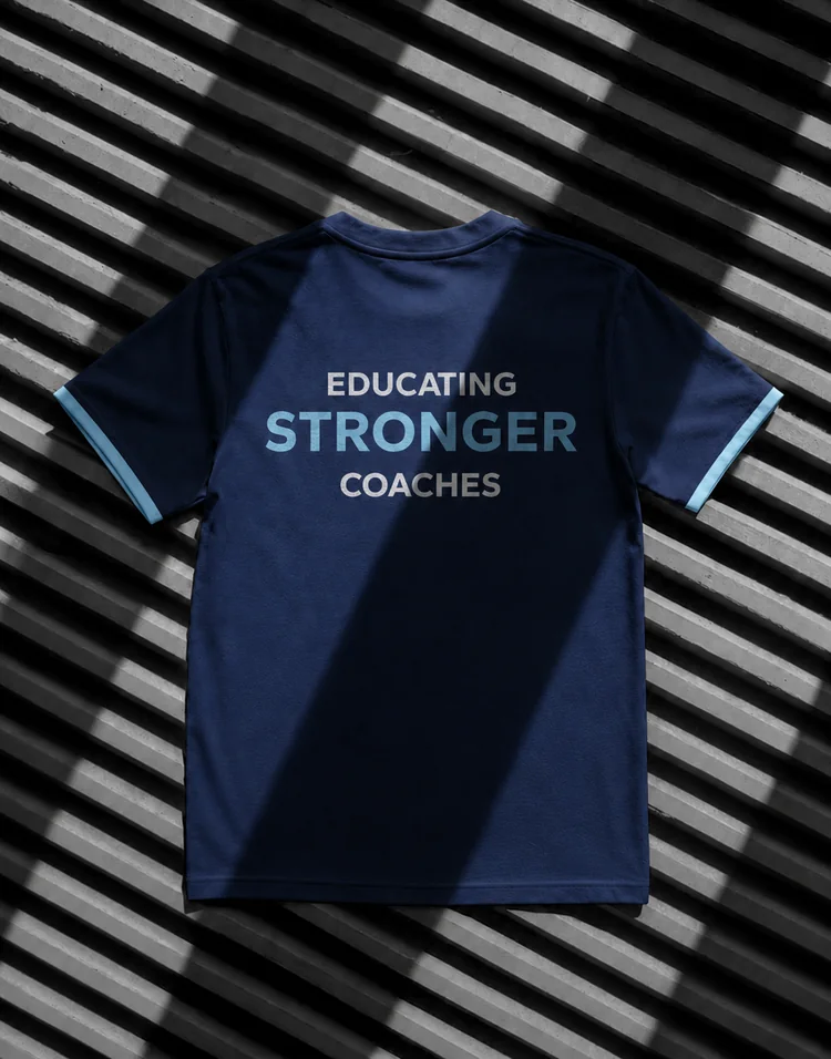
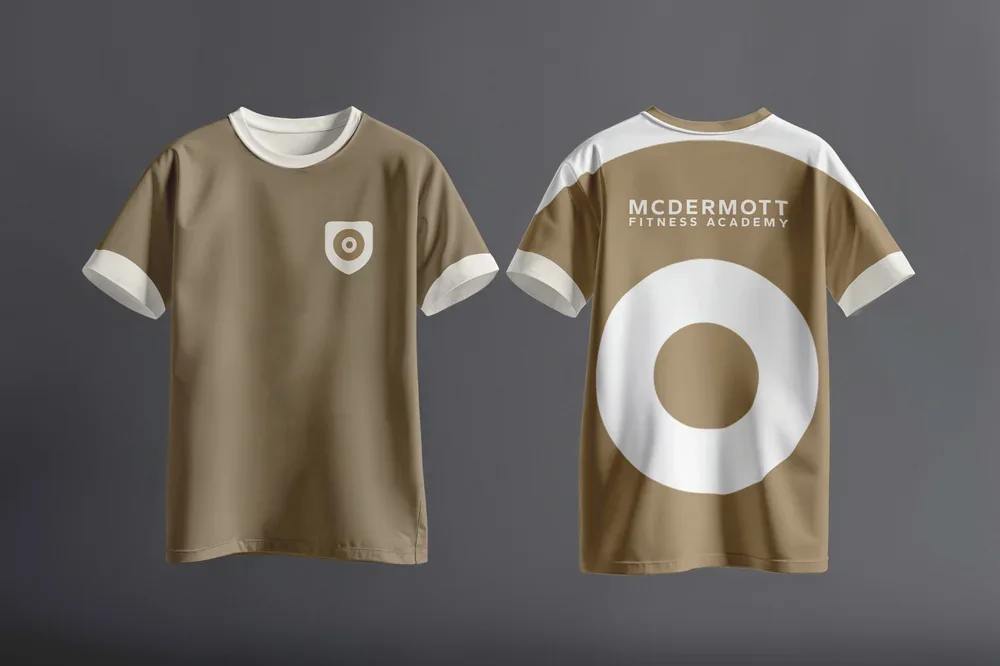
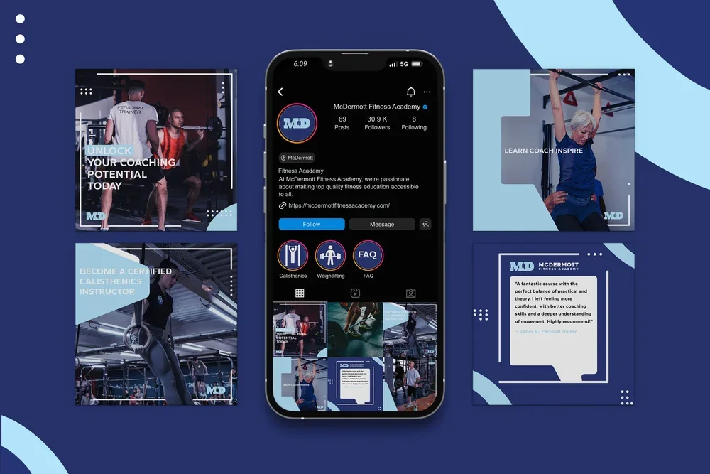
A coaching academy that trains other trainers. The audience is people who already work in gyms, so the brand had to look like a qualification worth having rather than another supplement label.
Rather than present one route and hope, we took two complete directions all the way to finished artwork, logo, apparel and a full social grid for each, so the decision was made by looking at the same things twice, not by imagining what the other one might become.
03. What lands
This is where these jobs usually go wrong. A designer sends a single PNG with a white box behind it, and two years later nobody can put the logo on a van, a shirt or a printed banner without paying somebody to redraw it.
Everything here is yours, in the formats the next person will ask for, with a written guide so anyone can apply it without asking us first.
How we work
You see work at every stage, and nothing goes to print until you have signed it off.
Before anything is drawn we establish where this has to work: a shelf, a shirt, a van, a phone screen. A mark that only works large is a mark that fails on half of them.
You get real directions applied to real assets, not one option presented as a done deal. If a route is wrong you can say so while it's cheap to change.
Spacing, sizes, the small-size version, the one-colour version, how it sits on photography. This is the part that decides whether it still looks right in a year.
Print-ready and screen-ready files, a written guide, and the source. Then you never have to come back to us just to get your own logo out of a folder.










It depends on where it has to work and how much needs making from it. Tell us what it's for and we'll quote within a working day, with the handover included in the price rather than sold as an extra.
Yes. We'll tell you honestly whether it's a new identity, a tidy-up of the one you have, or a single asset made properly. A full rebrand that throws away equity you've earned is the wrong answer more often than people expect.
Yes, all of them: vector source, print and screen artwork, the fonts, the licence and a written guide, with full copyright assigned to you. If you ever leave us, nothing has to be redrawn.
Yes. Artwork is converted to CMYK for the printer rather than handed over in screen colour, and we'll liaise with the printer, embroiderer or sign-maker if you'd rather not.
No. Design work is quoted as a project with the stages and the handover written down before it starts, and ongoing design support is month to month like everything else we do.
Yes. We're based in Newcastle and most clients are nearby, but we run work across the UK, in Spain and in the US already. Print and signage get shipped, and everything else is remote.
Our work
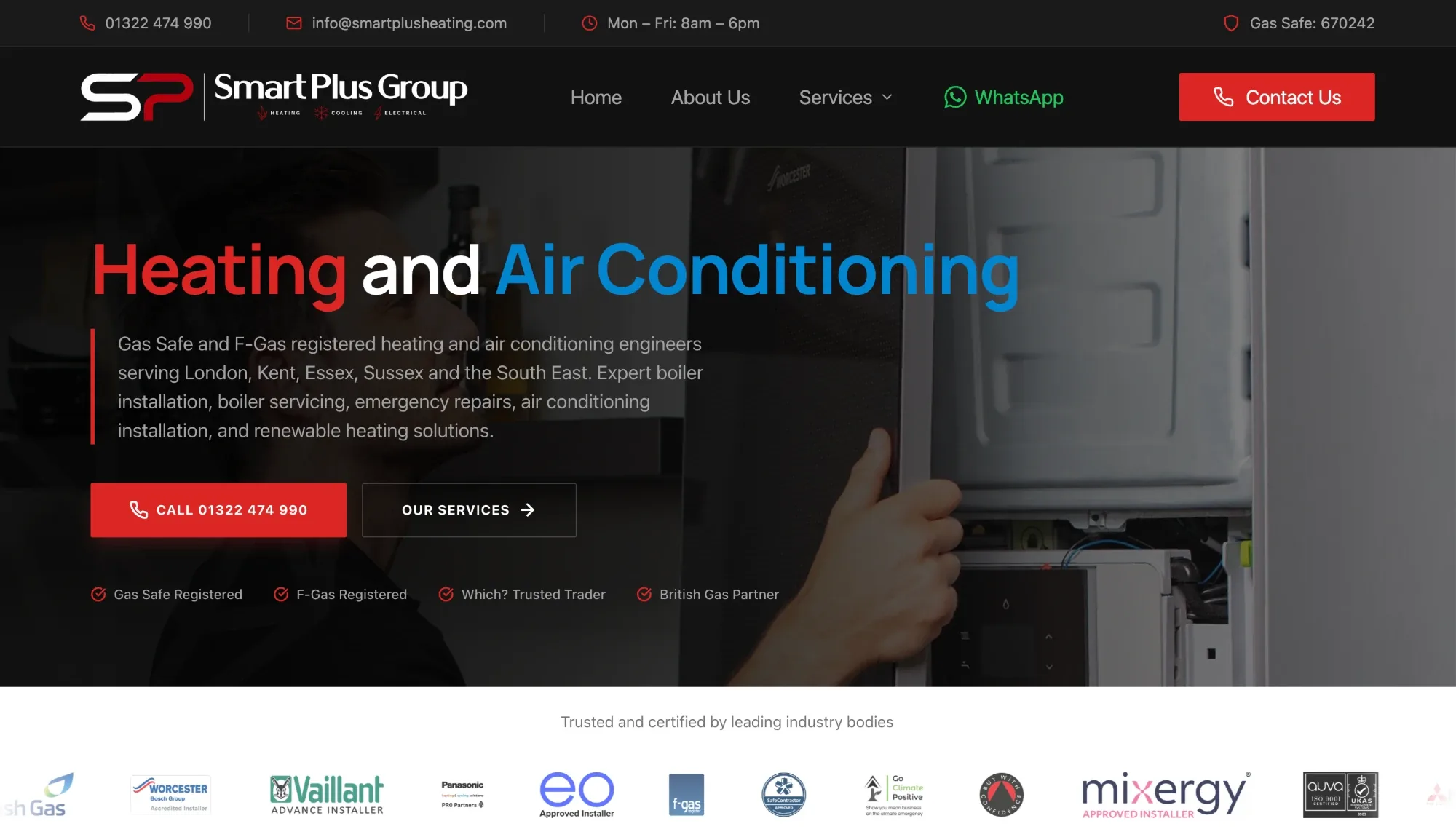 Website and local SEOHeating and air conditioning engineers across London and the South East.
Explore
Website and local SEOHeating and air conditioning engineers across London and the South East.
Explore
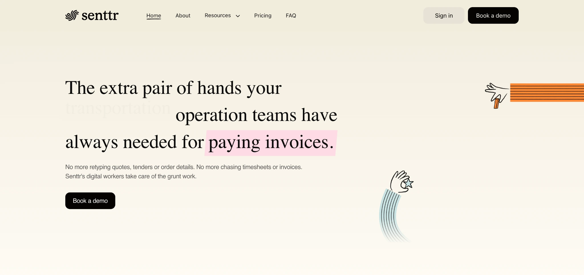 Website and product marketingDigital workers for operations teams, explained in one scroll.
Explore
Website and product marketingDigital workers for operations teams, explained in one scroll.
Explore
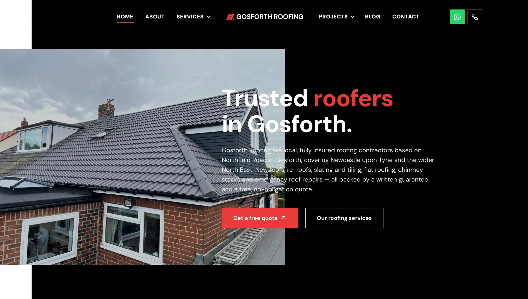 Website and local SEOTrusted roofers in Gosforth, found first on Google.
Explore
Website and brandingDriveways, patios and garden makeovers across the North East.
Launching soon
Website and local SEOTrusted roofers in Gosforth, found first on Google.
Explore
Website and brandingDriveways, patios and garden makeovers across the North East.
Launching soon
The rest of it
Every other channel ends up as something people look at. These are what the identity gets applied to.
Pages that rank still need to look like they belong to you when someone lands on them.
The ad, the landing page and the creative angles, all drawn from the same system.
The words the templates are built to hold, set in the identity.
The site is the largest single piece of the brand most customers ever see.
The templates and the grid your posts are made from, so the feed reads as one company.
Templates that hold up in Outlook and dark mode, in your identity rather than the platform's.
Start here
Tell us what it's for and where it has to work. We'll tell you honestly whether it's a new identity, a tidy-up of the one you have, or a single asset made properly.